Responsive non profit organization redesign Group Project (GDRNT)
Description
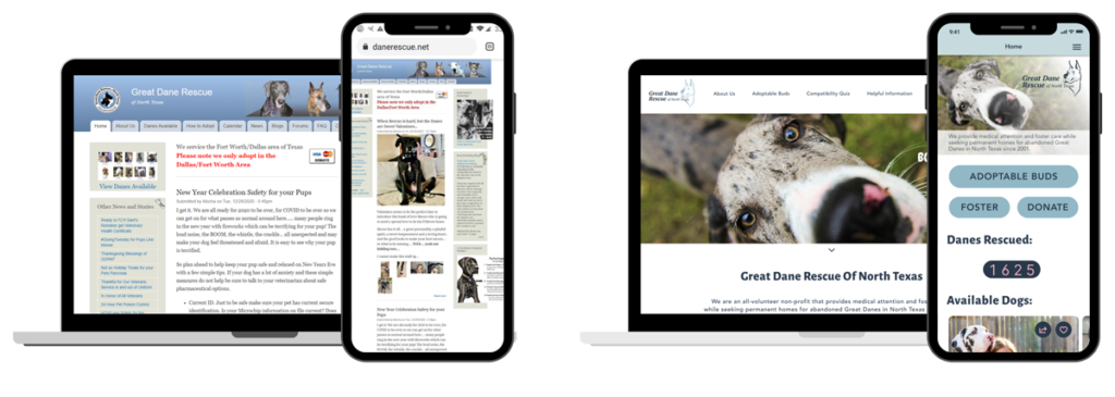
In this research project, we worked as a group to plan and conduct interviews with users, gathered user research, brainstormed solutions, made iterations based on user feedback to create web and mobile wireframes to create hi fidelity prototypes.
Goal / Challenge
Create a clean, engaging website that helps adopters find exactly what they are looking for – a Great Dane dog to love and/or help.
Timeline
Week 1-2: User Research, Interviews, Sketches
Week 3-4: User Testing, Iterating Prototypes
The Team / Role
Work with 3 teammates to create a responsive redesign of a non profit organization.
My Role: User Research, Interviews, Heuristic Evaluation, Lo>Mid>Hi Fidelity Interactive Prototype, and User Testing.
The Process

User Research

Data Analysis
Brainstorming & Ideation
Wireframing / Prototyping

User Testing
Research
We planned and conducted 5 user, 1 organization interviews, and 1 online survey.
(percentage of females)
Next we created categories of all the qualitative and quantitive data gathered to see if we can find a pattern or likeness between interviews.
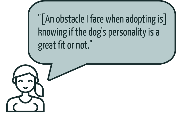
All shared the same frustrations of adoption sites not being updated and wanting to really connect with the dog they will be adopting or fostering.
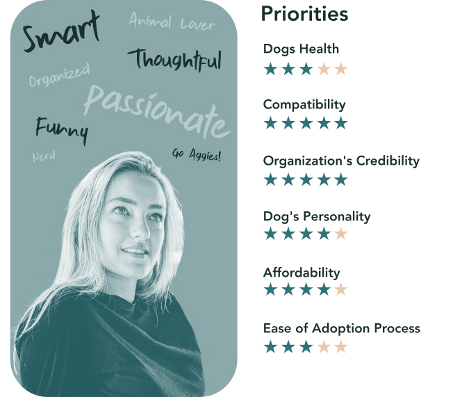
Survey Results: Priorities when adopting
definition
Our website is designed to make it easy for people to find their forever friend, even before visiting a shelter. We noticed that potential rescuers are getting overwhelmed by the amount of information provided, causing them to leave the site and resulting in fewer adoption applications.
April, the user, is an experienced veterinarian and animal lover who wants to have a simple and easy way to search for an additional forever friend that will match her animal family’s lifestyle and personality. We determined being able to connect with the dog’s personality and being able to find if it’s a good fit for a users family or not was top priority.
ideation
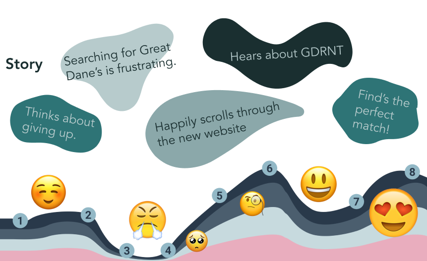
We created the user story and followed April’s journey to adding another great dane to her family that will fit in well with her lifestyle. After empathizing with the users frustrations and needs. we were able to brainstorm and iterate on some key features to incorporate with our site.
-Favorites Page, Interactive Dog Profiles, and Compatibility quiz.
prototyping
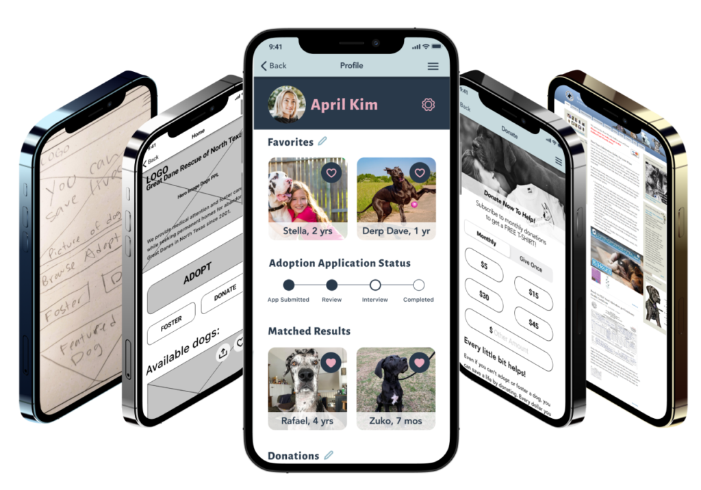
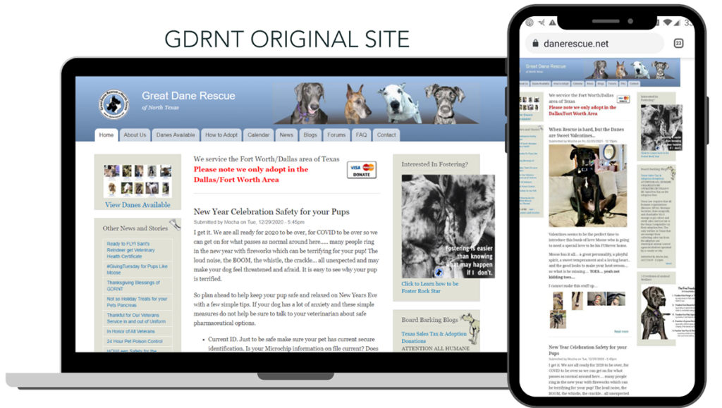
Before jumping into sketches we compared direct and indirect competetors and found that our site was lacking in a lot of areas. We highlighted what was and wasn’t working in our evalutaion. From there we sketched out some ideas, and to our suprise me and my teammate sketched out the same idea! We all decided to run with it, and turned it into a lo-mid prototype. Our priority was displaying the information users want and need, while maintaining a clean design.
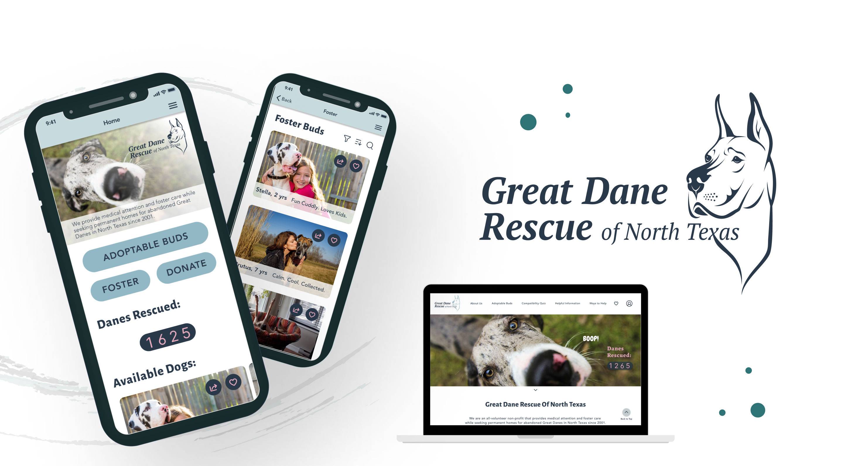
We started off designing the mobile version first, as most users searched through their mobile devices. We then transformed that mobile design into a web layout making the site responsive through out multiple platforms.
After some more testing we finalized the high fidelity prototype.
testing and results
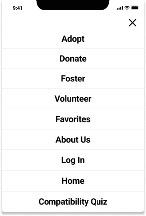
During our low fidelity testing stages we found a huge discovery that the menu navigation did not meet our users needs.
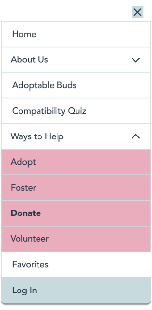
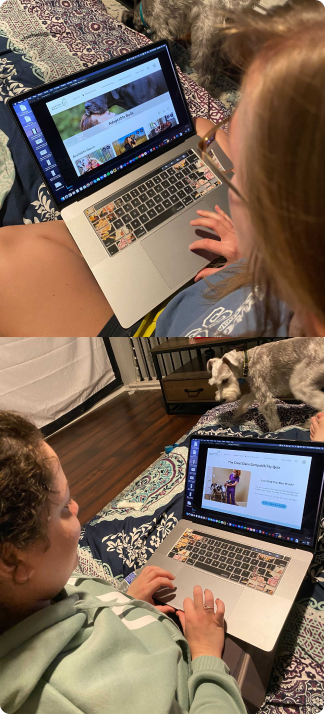
In our mid-fidelity iteration, we tested the three most important tasks: browsing and adopting, donating, and our match-making quiz. In this round, we discovered that our adoption process was still unclear. We also re-organized and re-labeled our menu to address user concerns.
Our high-fidelity prototype proved to be our most effective design, as all users were able to complete our three tasks. We found that there were some updates that were still needed in browsing process and in the donation section. Overall we had a 94% Success Rate with our user tests.
final thoughts
Reflecting on our starting point and our various iterations, we feel confident in our design choices as a team. During this project we learned the importance of using components consistently throughout the design process. If we used them sooner, we could have saved a lot of time and frustrations. Throughout the project we were able to overcome our obstacles by maintaining good communication and feedback.
Moving forward, we plan to incorporate a live chat feature and availability updates on each dog’s profile, as those are other high priority items for our users.

